The Polster Project
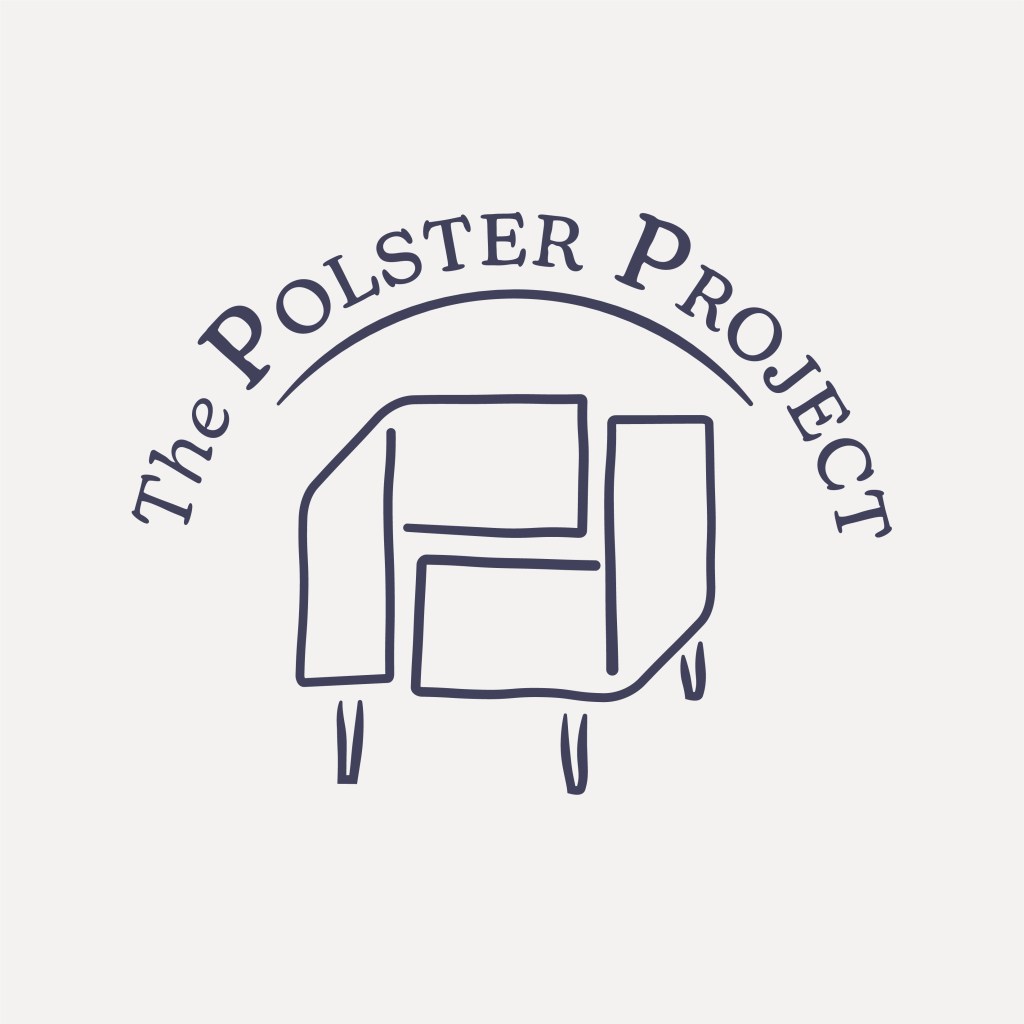
This logo was part of a recent project helping local small businesses develop their branding.
The brief was for a logo for an upholsterer local to New Alresford that included something like an armchair. I wanted to also create a focus on the idea of a choice of fabrics. Playing around with shapes and compositions, I settled on this design using a simple representation of two folded fabric swatches to form an armchair shape as well as the shape of two ‘P’s interlocked.
I gave the client a few variations in style and colour using typefaces New Kansas and Blenny Black, but felt particularly drawn to the homely feel in the above version.


Here is a mock up image of how I imagine the logo appearing on a shop sign:
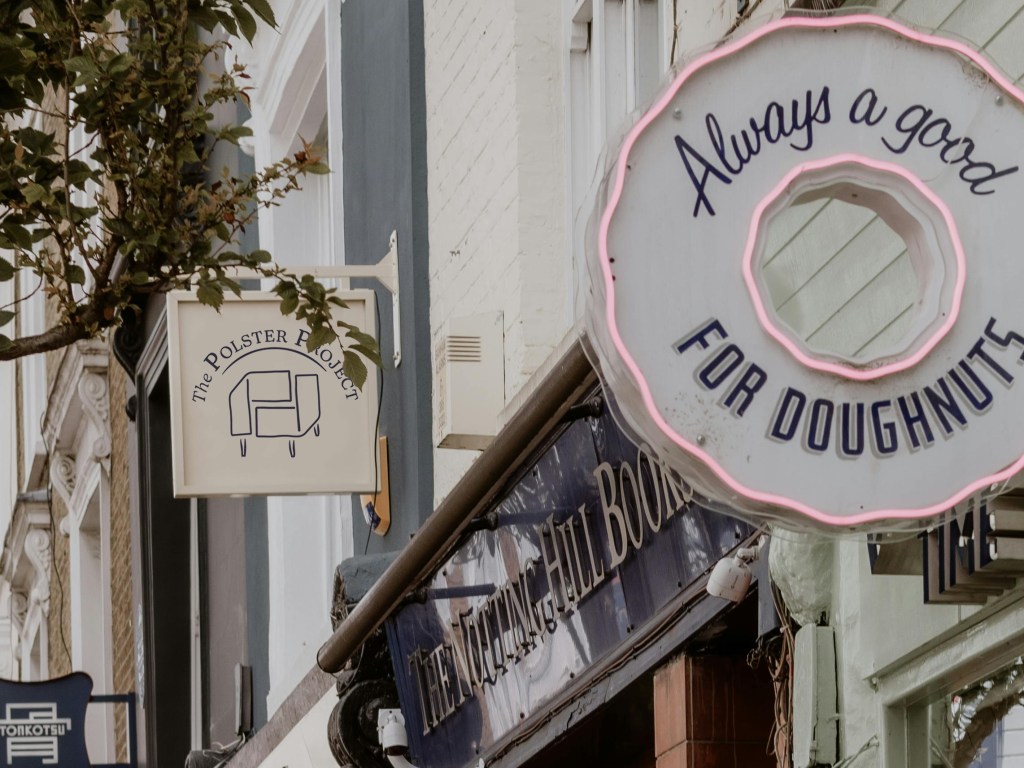
Image courtesy of Josh Withers/Pexels.
Daily Driven Events
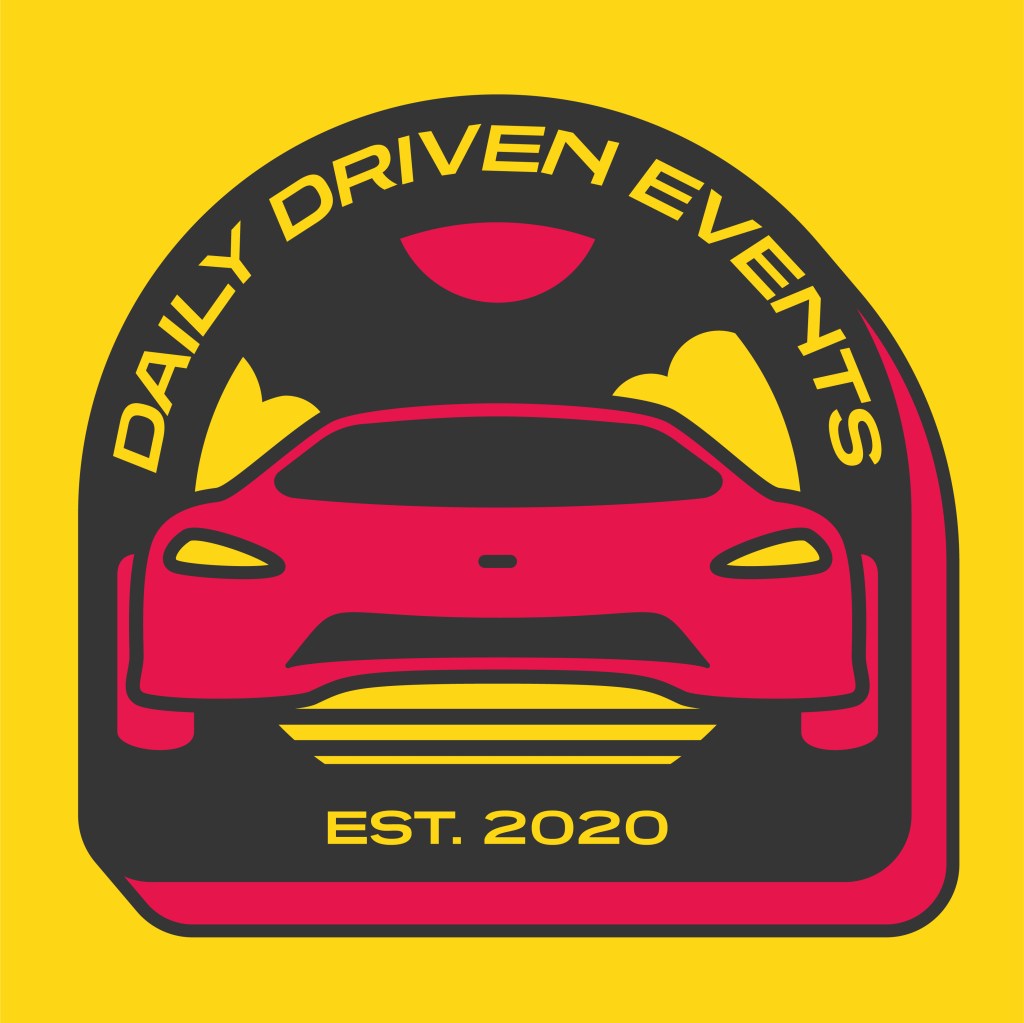
This project was part of a recent project helping local small businesses develop their branding.
I was asked to produce some ideas to help improve Daily Driven Events’ social media posts. I explored their current social media presences and investigated their target audience, and used this information to create some digital ‘stickers’. These could be used to distinguish their posts, adding an exciting element of visual interest to photographs and event posters while enforcing a unique and distinctive brand identity.
The colour selection was influenced by research into the brand’s existing posts as well as some of the most prominent car colours in the world of petrolheads. An article by HotCars on the best colours for a supercar focuses largely on the use of yellow and red by brands like Ferrari and Porsche. Chosen for this project are #ffd700 and #e6214c.


2nd image courtesy of Daily Driven Events on Instagram.
Joanna Lutyens Nutrition

This was a project about updating an existing brand identity. The client had a logo they wanted to develop and improve. The original design (not my work) is on the left below:
The aim was to incorporate new colours, especially a gold gradient and a darker green, and make any other fitting improvements to the overall design. I put forward the idea to combine the leaf-ring element with the JL initials from the original typeface to create the archway shape, symbolising a pathway to a new and better life and as such, creating a fitting message for potential clients of the nutritionist.
Along with more concise wording, this also enabled a more balanced composition and improved visual hierarchy, with a clearer brand name that the viewer is unable to miss.
The new brand colours:


And the some of the mock up ideas provided to the client during the process:
And some more of the final options:


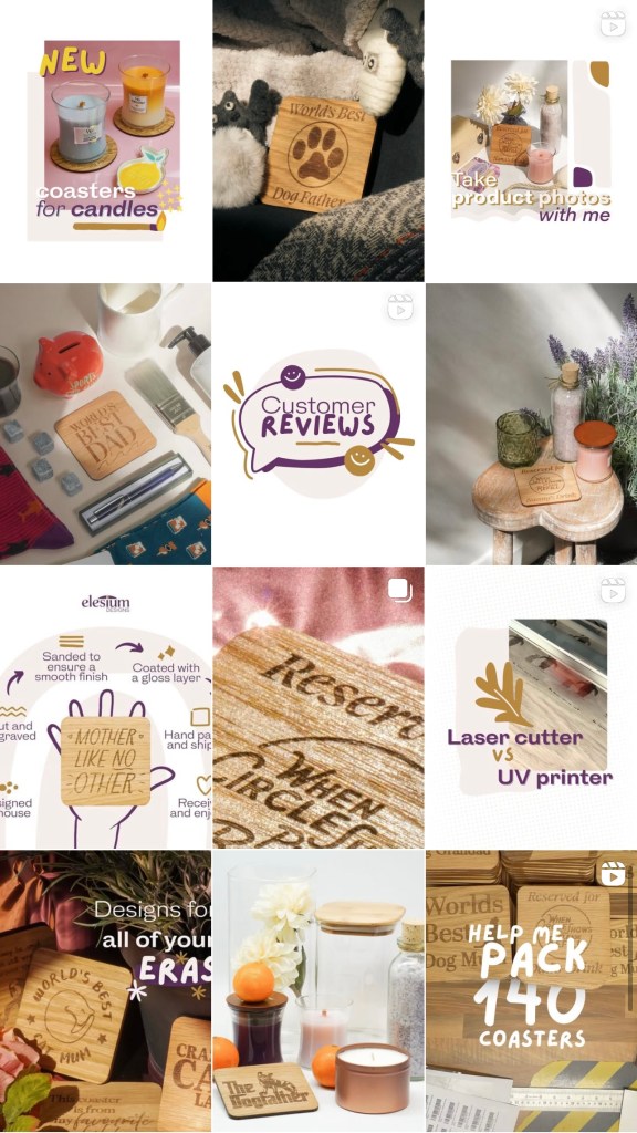
E-commerce coasters

I have developed a large number of novelty designs for engraved and printed wooden gifts — most notably drinks coasters — for a small business operating primarily on Amazon.


These coasters are successful in the giftware market, and as well as producing the designs I have been the sole photographer and content creator for the brand.
A preview of my Instagram posts for the coasters can be seen below. They consist of reels, single photos and carousels, including ‘behind-the-scenes’ videos showing processes such as product photoshoots and digital collages marketing specific features of the coasters’ designs. All the photos and videos are created and edited by me.
Please contact me if you have any further questions about this work.

Fingerprints

My final major project for my illustration degree was an investigation into illustration and book design for vision impaired children, and accompanied my dissertation The Roles of Narrative, Representation and Form in Effective Storytelling Resources for Vision Impaired Children.
The result of this project, Fingerprints, was essentially a proposal for how the form of a book could be adapted for vision impaired children. My research highlighted the necessities of access to books for children, and the idea of creating a foundation for a child’s sense of self through design drove the content of the ‘book’ (a series of multi-layered tactile engravings on wood covered with vinyl, plain sheets of contrasting text and braille, and a card sleeve), linking natural forms, such as the textures found on a tree, to aspects of human individuality.


Careful navigation of the design elements of this project was fundamental to its success. This required a thorough understanding of the materials and processes available; challenging the conventions of form was necessary to support meaningfulness in the project. I found that while some technical design features — such as tactile and visual contrast, and use of a bold or semi-bold sans serif font — are undeniably key to accessible reading materials, there is a lot of scope and need for more variety in such products. I hoped for this to be just one example.


Swatch
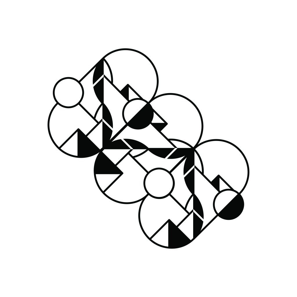

This was a competition brief from Prospect 100 with Swatch to create a monogram for the watch brand.
With a subtle inclusion of the letter ‘S’, the design refers to the concept of day and night, with the first rounded ‘pill’ shape representing the orbit of a sun and moon as well as the cyclical nature of time. The Swiss mountains are depicted as a nod to Swatch’s unique brand identity, and the two stacked leaf shapes symbolise the two hands that are intrinsic to all watch faces. The concept of twos is woven throughout the design as a tribute to the origin Swatch’s name: a contraction of ‘second watch’.
I wanted this design to feel versatile, yet exciting. After studying some of the most notable existing monograms, I chose to make this design easily adaptable to transformation and repetition, with building block-style elements; a nod to the playfulness of Swatch’s product designs.
Below are mock up images of how I imagined the monogram being used:


Images courtesy of Angela Roma and Monstera Production/Pexels.
